SharePoint Online a new way to store data
Leverage SharePoint to better organisation key company information, creating a company knowledge resource has huge benefits, here we will run through some of the built in SharePoint web parts which will make display that key information even more intuitive.

Adding a Web Part
Go to the page you want to add a web part to and click the edit button
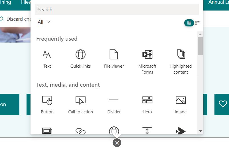
Next hover the mouse around the bottom on an existing web part or the top of the page underneath the main bar – if this doesn’t appear add a new section as demonstrated below – then you will want the + icon in the centre to add the web part.
Document Library
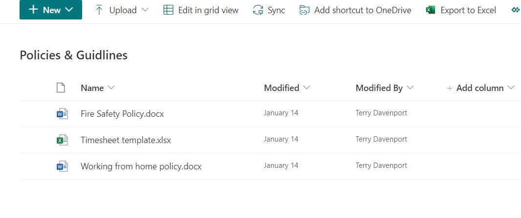
A Document Library Web Part allows for connecting and displaying document libraries in the web page, multiple Document Library web parts can be used on the one page to display a view of multiple file locations for ease of access.
Other options on this web part include the ability to show a custom view of the document library such as filter on specific files or when a certain condition is met.
Another useful option of this web part is linking the library at a folder within a folder using the nested folder option (For nested folders, type the path separated by ‘/’.)
Key Web Parts Explained
Web parts are snippets of code which can be used to add extra functionality to web pages or better graphical representation of information, essentially web parts are the building blocks of the web page.
Bing Maps
This web part adds a map function to the web page
Give the pin on the map a specific label or change the address that appears on your page. For example, you can add a specific floor or building name to the street address. You can specify to include the pin text or not.
View options include Street side, Aerial, Birds Eye or road, with the road view being the default view. On this view a toggle option is available to turn off street labels
Buttons
The Button colour is derived from the site theme, the options available are, the label name of the button – the link to the content (URL) and then button alignment, further alignment can be achieved through the use of layouts for example using two or three columns then adding the buttons into each of these columns.

Call to Action Buttons
This web part will give greater UI to a standard button, with a click/call to action, so as well as the button logic described in the Button Web part, using a call to action enables the use of a background image and text overlay to describe the use of the button, these look much better and are useful for promotions.
Conversations (Yammer)
Use this web part to add conversations to your leadership sites for employees to stay engaged with leadership, your employee news and service sites like IT support, HR, Travel, and so on for employees to ask questions and get answers, and on community sites for employees to share information and best practices with each other.
Group: Displays the most recent conversations posted in the selected group.
Note: If the selected community has a pinned conversation, the web part will display the maximum number of conversations plus the pinned conversation at the top.
User: Displays the most recent conversations that this user has participated in.
Note: This mode does not display the Yammer publisher to start a new conversation
Topic: Displays the most recent conversations tagged with the specified topic.
Note: This mode does not display the Yammer publisher to start a new conversation.
Feed: Displays the most recent conversations that show up for the user in Yammer when they click the Home button.
Home feed – Users can start a conversation in any community when configured to this mode.
In Search for a source, enter the name of the group, user, or topic.
In Number of conversations to show, select 4, 6, or 8, based on how much room you want the web part to take up on your page.
Yammer Highlights
Countdown Timer
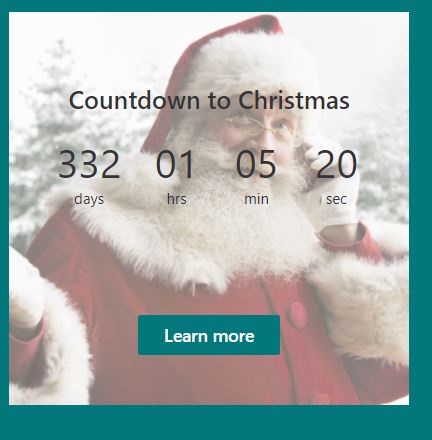
Used for key events you can set a background image and end date plus some text to describe the count down, example below:
You can also add a call to action so for example click here to find out more.
Divider
Used to separate web parts and add some padding to your web page, useful when the alignment of content is out from one column to the next when using a multi column layout.
</> Embed
Use this to interlink other websites content into the SharePoint website
Display content from a secure website by pasting the web address of the site. If that doesn’t work, try pasting the embed code from the site instead. Embed code must be iframe-based. Script tags are not supported.
Events
Pulls the events from the websites own event calendar, or can be set to pull events from all websites linked to the Office 365 tenant,
You can create new calendar events by selecting the Add event button once the web part is published on the web page
Two key layout views for this web part are the filmstrip or compact view
Group Calendar
Provides the functionality to link group office 365 group calendars such as those automatically created with each Microsoft team created
When you add this web part a button will appear stating add calendar you can select this and then on the right hand side you will see a drop down of all group calendars you can link – this will then display the upcoming entries from that group calendar.
Hero
This element is more of a user interface for neatly displaying content in a containerised view,
Two distinct layout options ‘Tiles’ or ‘Layers’
Layers option allows to give image one side then a bit of text and a button on the other side, this is automatically inputted based on the information from the web page url you enter where it states select link. Once the links are added an option becomes available on each of the layers like this:
If you select the edit button then you can specify the background any call to action buttons such as read more or a topic heading. Also you can enter a Title and Description.
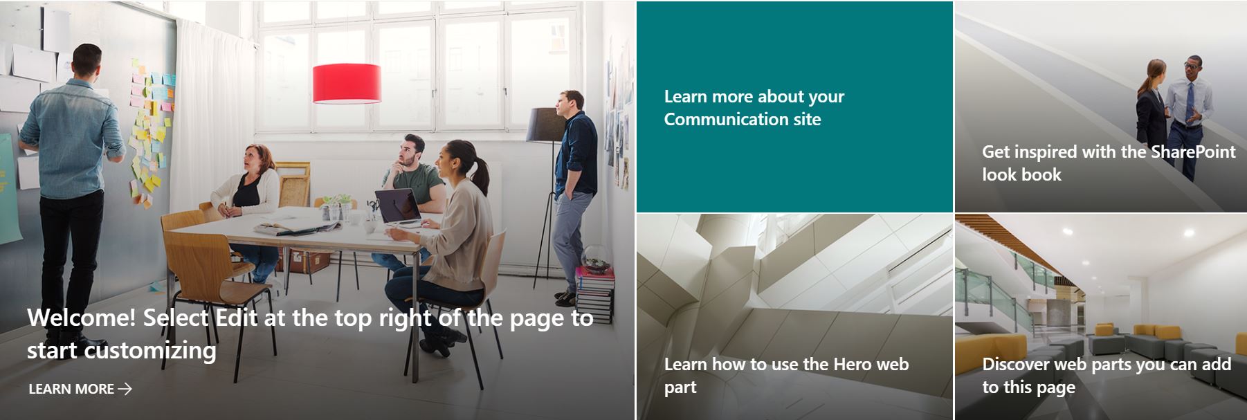
Tiles, is the more commonly used of the two design layout options similar to the above in terms of editable settings on each of the parts the key difference being that the graphics are grouped into one slab separated like tiles. A bit like the below example:
Highlighted Content
Shows a view of popular content – recent document changes
Image
Places to get Graphics from
Stock images are a group of standard images you can use within site pages to quickly add neat content without having to download and re-upload
Use the upload tab to upload files from the local pc.
Once the image is added the available options become apparent the top bar is for cropping, aligning and resizing the graphic.
Clicking the edit button to the left, displays other options such as hyperlinking the image to a web url, or adding alternative text (which is basically used for screen reading software often to help the visually impaired)
One other option which gives the ability to add text as an overlay on top of the image
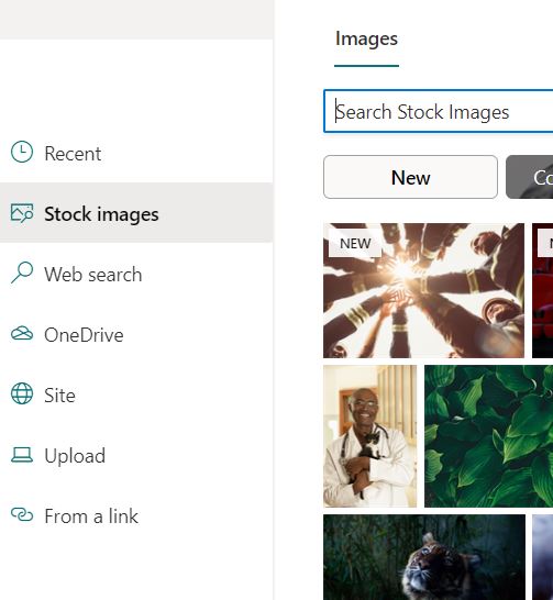
Image Gallery
Provides the functionality to have several images in the one web part an example shown below
There are three layouts available for this web part they are: Grid, Brick or Carousel.
Link
Allows a URL to be linked – it then puts a card together based on the web link entered a bit like the below:
Lists
This web part provides the functionality to embed the Lists created on that SharePoint Website to be embedded in the web page, you can create custom views of the list and embed the custom view as opposed to the default list view. This option maybe useful if you want to divide the information or show only a set category of the list data.

List Properties
Used in conjunction with the Lists web part the list properties allows you to put a section in which will display the full information from the given list entry from the list specified using the Lists web part.
Markdown
The Markdown web part allows you to add text to your page and format it using Markdown language, an example of this is shown below
This may also be useful when displaying programming syntax the Markdown web part shows a better representation of programming code.
Microsoft Forms
To use this web part you either need to create a form or get a share link of an existing form then use this link to embed into the Microsoft form Web Part.
My Feed
This web part will show the most relevant content for the current user from across Microsoft 365 suite of applications, so you will see things like forms, documents, web pages and so on, a different view will be displayed for each user depending on the Microsoft 365 services they have been using.
News
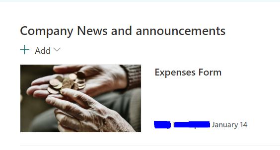
The News Feed web part can show a list of all news post on your SharePoint site or can display news from other sites which that user has access to; the last source option is to display Recommended news for the current user which pulls news from all SharePoint sites in the tenant which that user has access to.
Other options include the design layout of the news posts, a filter option to narrow down the news and a way to organise the news posts.
Organisational Chart
This allows you pull the information from the user tree so add a user into the below box then click the edit button and set the number of users you would like to see in the tree (number of reporting levels up).
Note this is based on the organisational tree from active directory – so who is who’s manager in Active directory depicts this tree
The page properties are pulled from the site pages library – default you will only see title as a page property, the use of this would be if you have multiple pages and would like to pull the page property into the web page. First of all you would need to create custom properties against the site pages list, so you would go to site contents – find site pages open that then you will see the pages list – next add a new column set the type out of the list, once this is created make sure you edit each of the pages and add in a property for each.
Once the above is complete you will see this page property in the drop down of the Page Properties web part – so in our example we created a new property called department so we then see Department and Title in the drop down list
Note: Properties you can add are Single Line of Text, Choice, Number, Date and Time, Person or Group, and Managed Metadata. All other properties are currently not supported.
People
Provides the ability to link in Office 365 people using a card type view which includes data such as profile information, name and Job Titled pulled from the person profile.
Two key views Compact or Descriptive
Power BI
Gives the ability to link in reports built in the Microsoft Power BI platform, your users would typically need access to the underlining report in order to view – required is a link to that report created in the Power BI application
Quick Links
Using this web part gives added functionality in terms of the graphical representation of links to other content which can be internal to the SharePoint site such as another page, view or document, can also be linked to external content such as web pages or resources.
Quick Links Views – Several options for views such as grid view, compact, filmstrip, Buttons, List or Tiles, then several size options
Adding a Quick link
Example Quick Link Button
Allows you to creative interactive charts, you can choose from a Pie Chart or Column Chart depending on the type of information to be displayed
You can enter up to 12 data points, or show up to 50 data points if you use a SharePoint list on this site as the data source.
Provides the ability to embed a public twitter profile into the webpage, specify how many Tweets can be displayed.
Weather
Ability to display the weather forecast at a given location.
World Clock
Embed times from other geographical locations.
YouTube
Embed publicly hosted YouTube content onto the web page.
